Films like The Devil Wears Prada invite viewers to expect excess and extravagance in fashion, publishing, and design across the board. However, ArtReview is not ostentatious in the least. Consequently, a recent workplace visit to the offices of this renowned publication, organized by WorkX, was initially something of a disappointment. When we turned onto an alleyway off Old Street and Editor David Terrien, parent of Clara (’19) and Ines (’24), welcomed us into their modest building, my unrealistic expectations were dashed. Movies glamorize the publications industry, and therefore it was first sobering, but ultimately refreshing to visit a real-world publishing house.
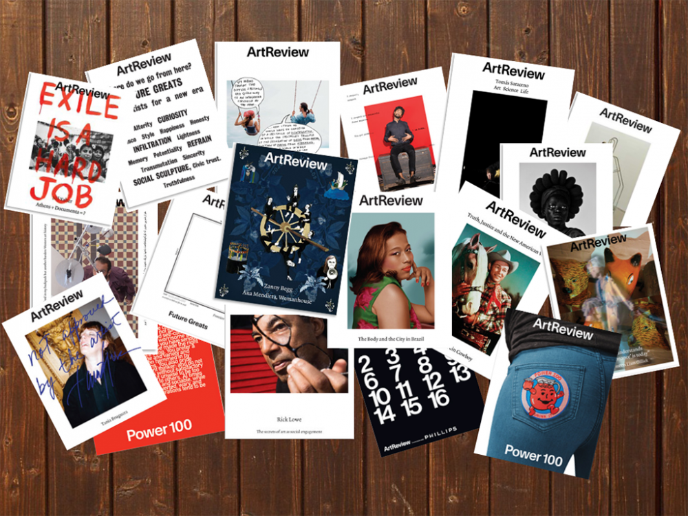
In order to meet the needs of the most visual generation the world has seen, businesses are increasingly using complex visuals and graphics to attract young people to their products. ArtReview, one of the world’s leading international contemporary art magazines, resists this current trend.
Flipping through numerous copies of the magazine, my peers and I immediately noticed the simple layout of each page and the vast amount of white space that the pages of ArtReview currently utilize. Terrien explained that their designer, Isabel Duarte, appreciates this timeless, traditional style. Many of us were critical of this approach because we’ve learned that minimalism doesn’t generally attract young people.
Upstairs, Duarte had plastered possible designs for the front cover of their next issue across two walls. The consideration that goes into her design became evident as she explained the many examples. At first, we disliked her layout for being plain, and suggested ArtReview diverge from simplicity to explore more modern, alternative designs. However, after she further explained the thinking behind her design, I realized it is cleverly intended to accentuate the subject matter of the magazine.
We viewed a former issue with unconventional spreads including angular lines, bright colors, and minimal text. While most students agreed this design was more attractive, Terrien shook his head, saying that it was too difficult to read. At that moment, I realized we weren’t considering the actual content of the magazine; our obsession was with surface appeal, not depth.
Each magazine possesses a theme that links the featured pieces together, and Terrien asked if anyone noticed the theme of the April issue. Again, we all flipped through the magazine, glancing at the pictures like children and produced no response. None of us bothered to read the introduction which explicitly outlined the theme “Paths of Resistance” and its connection to the #MeToo movement. The featured art included pieces such as “Woman House” and “The City of Ladies” which both related to feminism.
There will always be a place in this world for print journalism because people appreciate tangible text. Paper allows people to drag their fingers across the words and hold brilliant work in their hands. Later, when I devoted time to reading a few articles, I was grateful to be able to physically grip the magazine tightly and not be distracted by noisy layouts.
I was engrossed by the text and impressed by the caliber of the writing. Each piece was well-researched, clever, engaging, and accessible to someone even without an arts background. Unlike publications like ArtForum and Frieze, ArtReview is aimed at both specialist and general audiences, so there is nothing restricting any audience, specifically teenagers, from reading and subsequently building their own opinions on the art world.
Terrien said the magazine’s simple layout shows that “we are confident in our content.” ArtReview doesn’t need overwhelming layouts to attract readers because they want people to do more than just glance. Why cater to the visual generation if we aren’t even going to read the articles?
Most young people are more concerned with things looking “cool” than they are with the quality of the writing or artwork. However, ArtReview recognizes that the purpose of the magazine is to highlight worthy contemporary artwork, and busy designs would detract from that.
ArtReview is devoted to using classic methods to produce lasting quality. In an increasingly distracting world, young people would do well to follow ArtReview and learn to appreciate the adage, “Less is more.”
Written by Liz Merryweather
Graphic by Liz Merryweather