
In 1994, a graphic designer by the name of Vincent Connare sat at his desk at Microsoft Corporation in Washington. Connare was on his computer, looking at a copy of Microsoft Bob, an unreleased piece of software that was meant to be a user-friendly interface for email, document writing, and more. As Connare looked through this copy of Microsoft Bob, he noticed something very peculiar: the supposedly “user-friendly” software used the very traditional Times New Roman font. Times New Roman was created in the 1930s for use in The Times newspaper, and Connare didn’t think that it was suitable or appropriate for the user-friendly vibe of Microsoft Bob.
So, Connare decided to build an entirely new font for use in Microsoft Bob. He had seen the hand-drawn text on Batman Comic Books and decided to build a font based on the text in those comic books. He carefully traced the Comic Book text on his computer until he ended up with a letter he liked. In the end, he had finished what would soon be possibly the most famous font, ever: Comic Sans MS.
Though Microsoft Bob was never released, Comic Sans was still used in a different application, Microsoft Movie Maker, and the font soon became available on other apps such as Microsoft Word. Comic Sans was attractive to people across the world because of its friendly style, and people started using it everywhere. It was in schools and student’s essays, in restaurants and shops.
I myself grew up in a Comic Sans filled world. I knew Comic Sans from the time I was very young, and I remember noticing it being used in some very peculiar, and possibly inappropriate places. I can recall seeing the font in essays, in posters, and on homework assignments.

Vincent Connare, Creator of Comic Sans MS (and Trebuchet MS, among others).
With a small amount of online research, it’s very easy to find examples of Comic Sans used on gravestones, in scientific research labs, in printed books, and even on the Copa Del Rey (Spanish equivalent of the FA Cup) football trophy. Text written in Comic Sans was quite literally engraved on a gold sports trophy.
Given these examples, I think it’s important to note that every font has a purpose. Connare was right to say that Times New Roman was not suitable for Microsoft Bob, as Times New Roman is best suited for printing, long pieces of text such as in newspapers. A font like Audiowide may be appropriate for use on a movie poster for example, but not on an essay or research paper.
And the same thinking can also be applied in the case of Comic Sans. The font may be appropriate for use in a children’s book or a product like Microsoft Bob, but it’s clear that Connare did not initially build it to be used on gravestones, restaurant menus, or sports trophies, as those are meant to convey more formal and serious tones.
In fact, Connare has pointed out some of the usual uses of Comic Sans at his talk about the font at a WIRED conference (Comic Sans is ‘the Best Font in the World’), where he showed pictures of Comic Sans used in political documents, and even a picture of a famous basketball player wearing a shirt with text written in Comic Sans.
Many people may think that the frequent inappropriate use of Comic Sans is not an issue, as misused fonts don’t really have a profound negative effect on society.
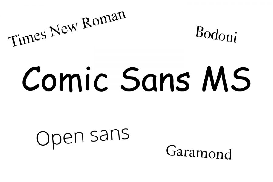
However, for me, every font has a personality and emphasizes different things. Garamond shows traditionality but is still stylish in the modern-day; Bodoni shows a very old style of writing; Lato is very modern and easy to read; and finally, Comic Sans is friendly but uneducated and young, and almost looks as if it is a ten-year-old’s pretty handwriting. It’s important to choose the right font for the right situation.
For example, this year, my science teacher gave an assignment with chemical equations and atom structures, all written in Comic Sans. In this case, it may have been more appropriate to use a more traditional font like Times New Roman or a cleaner font such as Open Sans.
So, what can you do to help fix this problem? I think an important first step is to recognize that Comic Sans is simply overused, and it would be unwise to use it apart from very specific situations, such as in elementary schools, in satire and other cases in which text is trying to convey a young and friendly tone.
Also, others are aware of the Comic Sans problem and may judge people negatively if they use the font. It’s important to point out when someone is using Comic Sans inappropriately to spread the word and finally end the misuse of this font.


Maarya • Apr 23, 2020 at 1:49 pm
Thank you, I will now be deleting comic sans.
Peggy Elhadj • Apr 22, 2020 at 9:02 am
In the past, I have not paid much attention to the differences in fonts, but I will do so now.
Thank you Gabriel, for educating us on this fascinating topic.