Staff Writer Izzy Harris
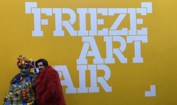
The Frieze Art Fair takes place during the first weekend of October in Regent’s Park each year. Having never been before, I had my sights set on attending the renowned contemporary and modern art fair, as well as its traditional pre-20th-Century companion exhibition, Frieze Masters, in the hopes of understanding what about Frieze draws the attention of anyone ranging from art analysts to civilians like me. After spending a day at this year’s Frieze and Frieze Masters, I’ve narrowed it down to five pieces from both exhibits that will stay with me long after the temporary tents are removed from Regent’s Park for another year.
FRIEZE
1. Blue Lines, Michal Rovner, 2018

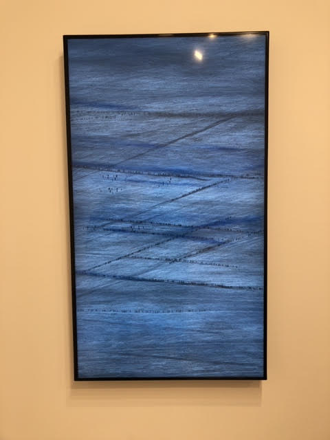
This piece was one of the first ones I came across when I arrived. From a distance, it may look like an ordinary painting, but upon further inspection, it turned out to be a T.V. monitor displaying hundreds of people walking, forming dotted blue lines across the screen. From a design perspective, it was unique and captivating in the way it was constructed to show motion through the lines.
2. Derniére Seconde, Christian Boltanski, 2018
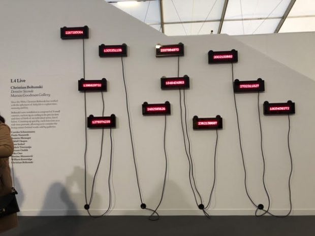
Each number that was displayed on the LED faces of the installation correspond to the birthdate of a specific artist in time, such as Yoko Ono and Annette Messager, displaying the minutes since their birth in real time. I found the idea behind this piece to be fascinating due to time being used as the focus and it gave a more personal touch to the entirety of the fair.
3. The Shaman, Tatiana Trouve, 2018
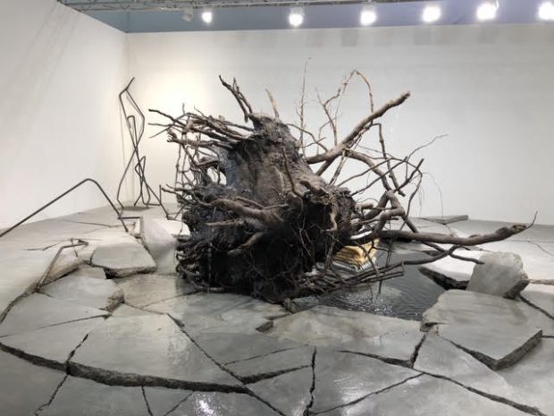
The intricacy of the branches was obviously not purposeful, and that contributed to the general hectic aesthetic of the sculpture, making it a favorite by far. The detail I found most fascinating was the water dripping out of the branches to mimic the fall of water on trees into the pool below. The visual of the broken cement ground forced my eyes to wander throughout the piece, giving me a lot to explore.
4. Francesco, Urs Fischer, 2017
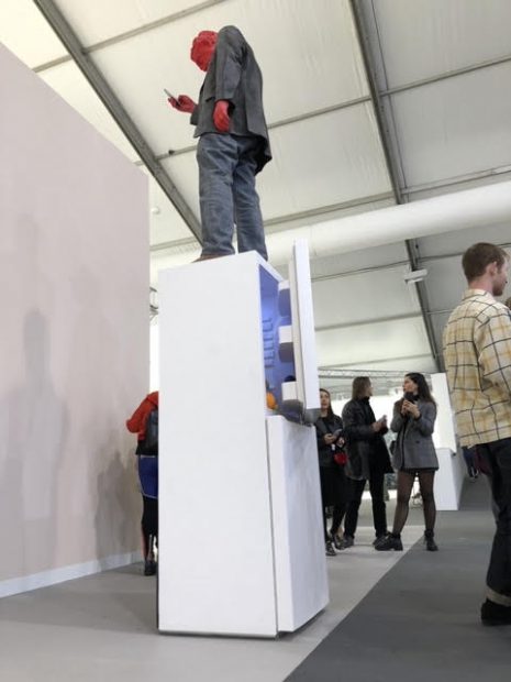
I found this to be one of the more thought-provoking pieces of the day. When I first came across it, I noticed the refrigerator was open, and the red man was standing atop it on his phone. It seemed to fit a general theme of the relationship between people and technology because the refrigerator was left unattended and the food is presumably going bad. Art often tells stories, and I could see this one as a warning to society of a world where we do prioritize phones and other technology over nutrition and wellbeing.
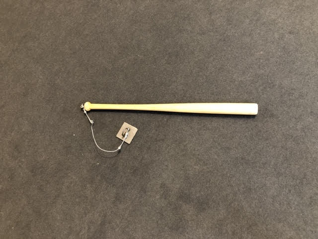
5. Radius, Clara Ianni, 2010
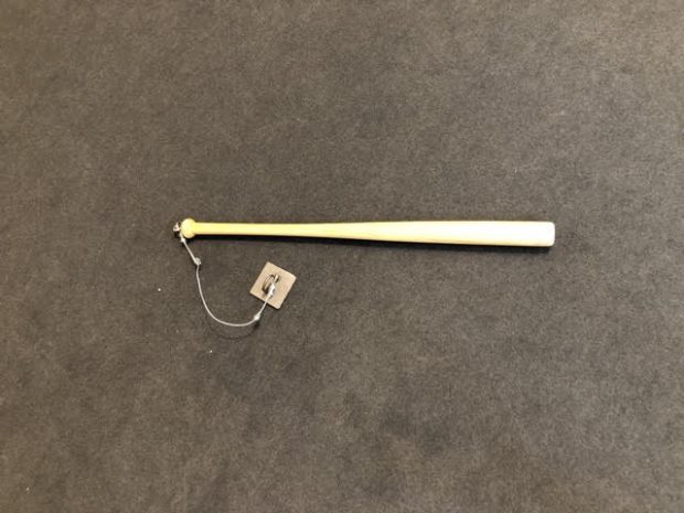
This piece, meant to symbolize destruction, was very simple but conveyed a strong paradoxical message to the audience of a violent object, but not having it be useful enough to commit violence. I found this piece to be psychologically confusing and requiring a creative mind to fully understand the intent of it. The complexity of the intent of the piece with the visual representation made me deeply confused but enlightened at the same time.
FRIEZE MASTERS
This part of the exhibition was geared more towards the art of the early 20th, 19th, and 18th centuries. While this isn’t something I would naturally gravitate towards, I decided to give it a chance since everyone raves about Masters each year. What I found was that it contained more of what you would expect to see at a museum like The Met in New York or the Louvre Museum in Paris.
1. China de Sade, Steven Parrino, 1987
This painting made me feel very uncomfortable as it was painted on the canvas, but then was contorted and stapled asymmetrically. From past photos, it appears that everytime the piece was displayed, the canvas was distorted differently, giving it a unique look for each show. The simplicity of the piece made me question the legitimacy of artists who use monotone colors in their paintings because of how easily they would be to replicate.
2. Analogues, Nausica Pastra, 1989
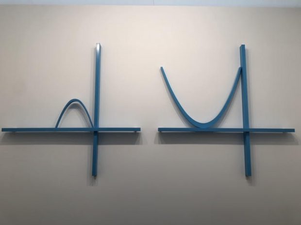
I was not expecting to see parabolas at an art exhibition, but I found them to be elegant and creative. Many of the other pieces in the gallery had mathematics as their focus and it was a great way to illustrate the collaboration between math and art. The fact that one of them was facing down and the other was up made me think about the positives and negatives of life and how art often portrays emotions of happiness and sadness.
3. Horizontal Progress #4 and #7, Sol Lewitt, 1991
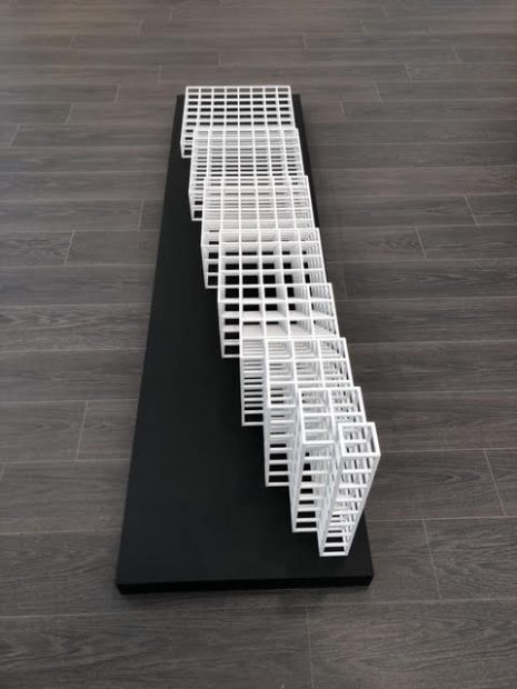
In total, there were about five of these sculptures on the ground in the gallery. I really enjoyed how the cube structures changed depending on the viewer’s position relative to it. It felt like a different sculpture every time I looked at it from a different angle. No two people are able to see the same view if they were both looking at it, and that is an individual aspect of these two pieces that I loved.
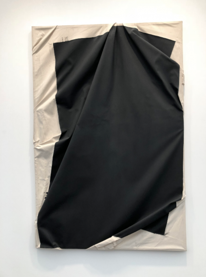
4. Superficie Bianca, Enrico Castellani, 1970
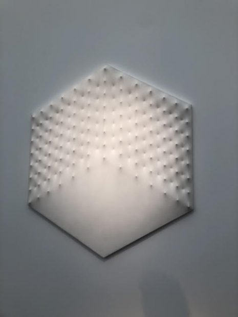
Although not a traditional painting, Castellani reformed the canvas so that from a distance it looks like a painting. Many people look at art as a 2-D figure, but this piece challenged me to view it in a 3-D perspective, creating an imaginary cube in my head.
5. Space of Rocket X., Stano Filko, 1967
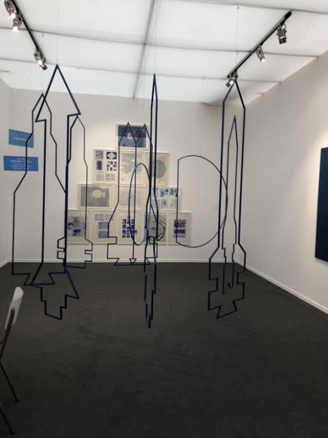
These hanging metal frames reminded me of the SpaceX rockets, and were similarly titled, but had been made years before SpaceX. The metal work was attractive in the way it was displayed with the entire gallery color complimenting it in shades of blues and whites, much like the sky. By having the metal pieces hang from the ceiling, the illusion of zero gravity made me think more about innovations in space travel, and what they’ll be like in the future.